electsept1.jpg
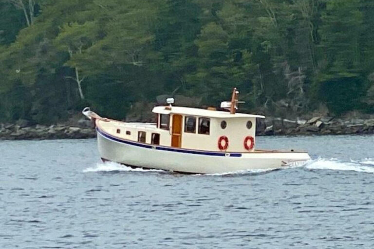
The black four-door pickup came barreling around the bend, swinging into the four lanes of stop-and-go in front of the airport arrivals terminal. I threaded my way between the cars and jumped in, having spoken to its occupants via cell phone from the plane after we touched down. Now everything was coming together. After a little more than an hour on the road-picking up a boat on a trailer along the way-we would be underway on a 20-foot center console on the water, mapping the minutiae of the bottom, recording the precise location of humps and ridges, charting the underwater world.
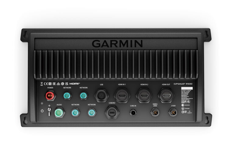
I had come halfway across the country to ride along with these two guys, Shaun and Mike. My mission: Find out all I can about where all the mapping detail on electronic nav charts comes from, and learn how it all gets put on those quarter-sized computer memory cards that go in the slot on a chart plotter.
All indications were that this was not going to be easy. My preliminary research told me that the companies that produce such charts guard their methods carefully. As you have probably noticed, there are some really cool ways to look at electronic cartography out there. I must admit I’ve always been most familiar with Navionics. I’ve used their Gold product quite a bit and found it loaded with information, and each new release is peppered with innovative updates. With Navionics in the crosshairs, I set out to gain their trust.
After a few weeks of calls, e-mails, and cajoling, I scored the invitation I was looking for. An early morning departure from LaGuardia and one fortuitous connection later, I had arrived in Minnesota, where I had made contact.
“Shaun” was Shaun Ruge, the Navionics sourcing survey manager. I rode along with him and his wheelman, survey technician Mike Westberg, as they surveyed Lake in Minnesota. And, as you will see, they’re really interested in getting it right.
Sounding Bored?
Navionics contracts with a company called SonarMap to gather raw data. The SonarMap survey technicians work in teams, but they spend much of their time alone. That’s because they have a boat for each man in the team and they spread out to cover as much ground—or water—as possible. It’s one man, one boat.
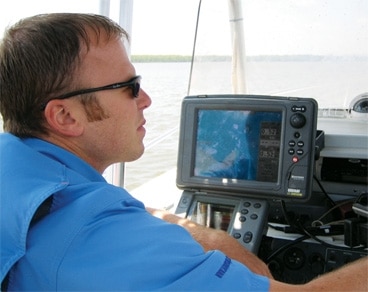
The survey technician uses a multifunction display with a GPS and chart plotter connected to a digital fish-finder and a beat-to-hell laptop. The laptop records all the data. So the sounder and GPS combine to give the depth data for each lat and lon position. If you think about it, an electronic chart is really a list of locations and depths-the simplest definition of a chart. But there are plenty of lat/lon points out there, so it isn’t that easy to get that data together.
On this project, updating the Navionics HotMaps product, the surveyors go to their assigned lakes, splash their center consoles, hook up their electronics and go. In the interest of efficiency, they try to run in a uniform pattern-basically they “mow the lawn,” running parallel tracks across the lake, ending each pass with a 180-degree turn. I saw them work this pattern firsthand, and it was interesting to watch. For one afternoon on a nice, sunny day.
| | |
“We have guys apply all the time who say they would love to work on a boat,” says Ruge. “Some of them last only a couple of weeks.”
Aside from the substantial challenge of monotony, these survey technicians can run into problems, just as anyone can if they spend enough time on the water. They wear out equipment, most notably outboards. After a few of their motors sent their flywheels flying, taking the cowlings along with them, the outboard manufacturer sent a factory technician to dismantle the units, just to see what the problem was. The hard use of the engines had revealed a design flaw.
Accidents happen: Sometimes the techs hit stuff with their boats. Yes, that’s right, the guys who make the charts run aground. That’s going to happen when you cover a whole body of water. The survey technicians can get pretty much the same results at 15 or 20 knots as they can at idle speed. Since they use a standard fishfinder rather than forward-looking sonar, they haven’t got much chance to avoid obstructions. If the obstruction doesn’t appear on the chart they’re using-generally a Department of Natural Resources (DNR) chart in the case of these lakes-the surveyor may be the first to find the obstruction. But it’s better to find it with the transducer beam than with the skeg and prop of the outboard.
This is why they do it. Some of the lakes they’ve surveyed have four or five soundings for the entire acreage. There’s not that much information available other than the old surveys, which Navionics used in their initial chart. The surveying program is out to plug the enormous gaps that exist in the DNR data-doing 150 lakes each year.
They also fix problems with existing charts. If an end user contacts Navionics to tell them something is missing or has changed on the chart, the customer service representative will take the information and pass it on to the survey team. A prime example of this service was on our Minnesota lake, where someone had reported seeing what appeared to be a sunken car on the fishfinder. We did an expanding search pattern, even keying on the movements of local anglers, to try to track down the submerged hulk. No luck, but not for lack of trying.
“Once NOAA is done with something, they cross it off the list,” says Ruge. “If we hear of something we may have missed, we’ll go back and get it-it’s a work in progress.” Navionics adds the correction to its database and includes it on the next chart release.
Worth its Salt?
I know what you’re thinking: Why do I care about lake charts? The truth is you probably don’t. But you do want to know where Navionics get its data for the marine charts.
Here’s the bottom line: The charts available in the vast majority of electronic cartography put out by Navionics—and others—is actually derived from the same data you know, love, and trust that appears on the paper charts from NOAA. If you think about the resources spent to create, publish, and update that data for public consumption, this is a smart move—we’re standing on the shoulders of giants, to paraphrase Newton. So if you really think about it, is there any need to reinvent the wheel? Well, no. . . and yes.
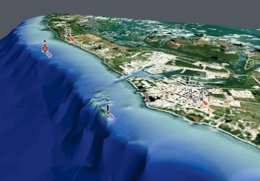
Easy answer first: Navionics uses the “approved for navigation” soundings that appear on NOAA charts. But they do stuff with the soundings that few others do. They give them the interesting three-dimensional-looking views that show an avatar of your boat floating safely above craggy pinnacles and dizzying dropoffs. That’s sexy stuff, but, as any parent can tell you, sometimes sexy serves a purpose. These views, and the perspectives and points of view that they offer can be manipulated, giving the user the view he wants. Setting it the way the user wants also helps him better visualize his boat’s placement in its immediate environment, and that’s the whole point of charts.
But anyone who’s seen these three-dimensional views, reminiscent of virtual reality, knows that the wheel has been reinvented in some way. Where does that video-game-like view come from? And the seamless views of every other piece of data on the chart for that matter? I asked Ruge and realized that this is where the access really ends.
Data Entry?
Here’s the brick wall, where all the secrecy starts. The data sent by Ruge’s surveying program is processed through the proprietary post-production system at Navionics. Whether the data is from the lake surveys or from NOAA charts, it all goes through this system. It’s so involved that Ruge’s teams work with deadlines that give the post-production staff six months to tweak up the charts.
If the survey teams generate raw data, it’s the post-production team that makes that data work for you, connecting the dots. They run it through proprietary software that gives you usable contour lines to follow. But that’s only the most basic part of the process. They also create the three-dimensional world so many of us like to steer in nowadays. And they add all the other data that is carried in cartography packages like Platinum+. Useful stuff, like where to get a good hamburger in that next port of call on the (virtual) horizon.
|
| | |
And their commitment to the data is impressive, even to Ruge. “We could buy listings for all those port services from the yellow pages,” he said. “But we wanted to be sure the data was good. We set up a call center and brought in a staff to contact each place and make sure they were still there, and that the number and location were right.”
So when the data isn’t good, they try to fix it. Case in point: the well-traveled waters of the Bahamas. The Admiralty charts of the area have some soundings that are hundreds of years old. Ruge and his team headed to the Bahamas to mow the lawn and fill in the blanks.
“Some users knew and liked the old soundings,” says Ruge. “The contour lines have changed in spots they knew for years from their old charts.” But in the world of charting, correct data is king. And for Navionics, making it right is a top priority.